Ramayana Dining
Ramayana Dining:
Before & After
We’re excited to share the dining room of our newest project today! Nestled in a quiet neighborhood in Redmond, Washington, the home had beautiful architecture, with large windows, a vaulted ceiling and detailed wall treatments throughout, which set a great foundation to build from.
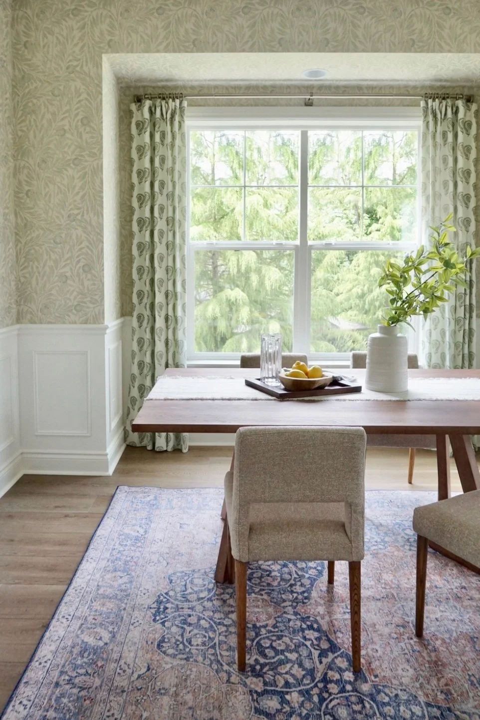
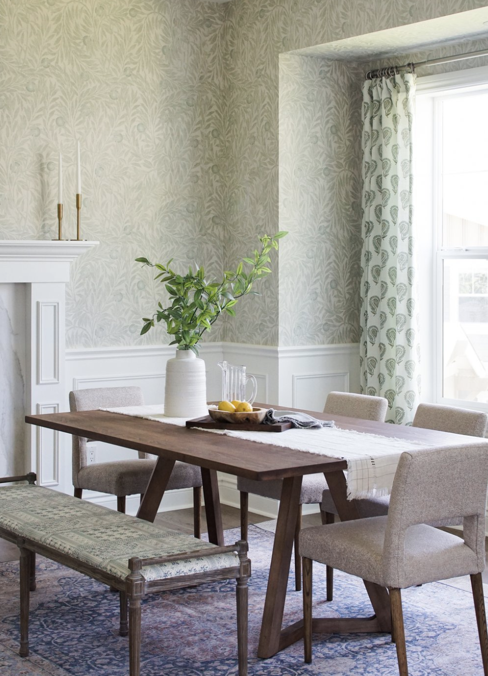
Our client loved pattern, so we started with a wallpaper as the focal point. Its’ muted tones add warmth to the space, while the curved shapes in the pattern bring softness and personality.
PROGRESS
We paired the wallpaper with another print, for the drapery, in a similar tone. The wall molding along the lower half of the walls balances out the pattern on pattern look, adding dimension to the space.
DESIGN TIP: When selecting patterns for a room, look for complementary tones. Below, a soft green carried through each print which creates a cohesive look.
AFTER
We centered the room with a large custom dining table in a rich tone for depth, paired with soft grey linen chairs and a batik bench. The furnishings were intentionally kept neutral to allow the pattern on pattern look to shine.
BEFORE
AFTER
The wall opposite the window was large in scale, so we needed to find a solution that filled the wall space but also not distract from the wallpaper behind. After brainstorming different ideas, we landed on this concept of a floating frame photo gallery wall.
Instead of mat boards, we opted for clear plexiglass with a single photo in each frame. The wallpaper carries behind the glass, running up to the photo, creating a beautiful moment that ties the design of the home into the story and background of our clients’. The design creates a higher end custom look, a spin on the traditional gallery wall concept.
The hard finishes in the home were also updated — the carpet was replaced with hardwood, the walls were painted, and the tile surrounding the fireplace replaced. Updating hard finishes like these in a home are so impactful when it comes to affecting how a space feels, more than furniture!
We’ll be sharing a few vignettes of the living room in the adjacent room next week, so be sure to check back for that!


